
I’m so thrilled to be featured in this month’s Traditional Home as part of the Regional Color Conversation with Pratt & Lambert Paints!
As all of you who keep tabs on me know, I’ve had the opportunity to live in so many amazing cities (and now I’m taking on Dallas!) but it’s really Philadelphia and its east coast classic colonial style that has influenced who I am as a designer and my overall aesthetic. So that’s why when Traditional Home and Pratt & Lambert approached me to join the Regional Color Conversation, I immediately gravitated toward the New England colors as representing my signature palette and design style.
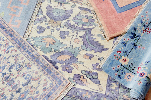
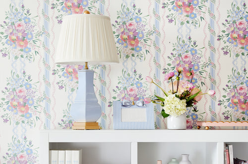
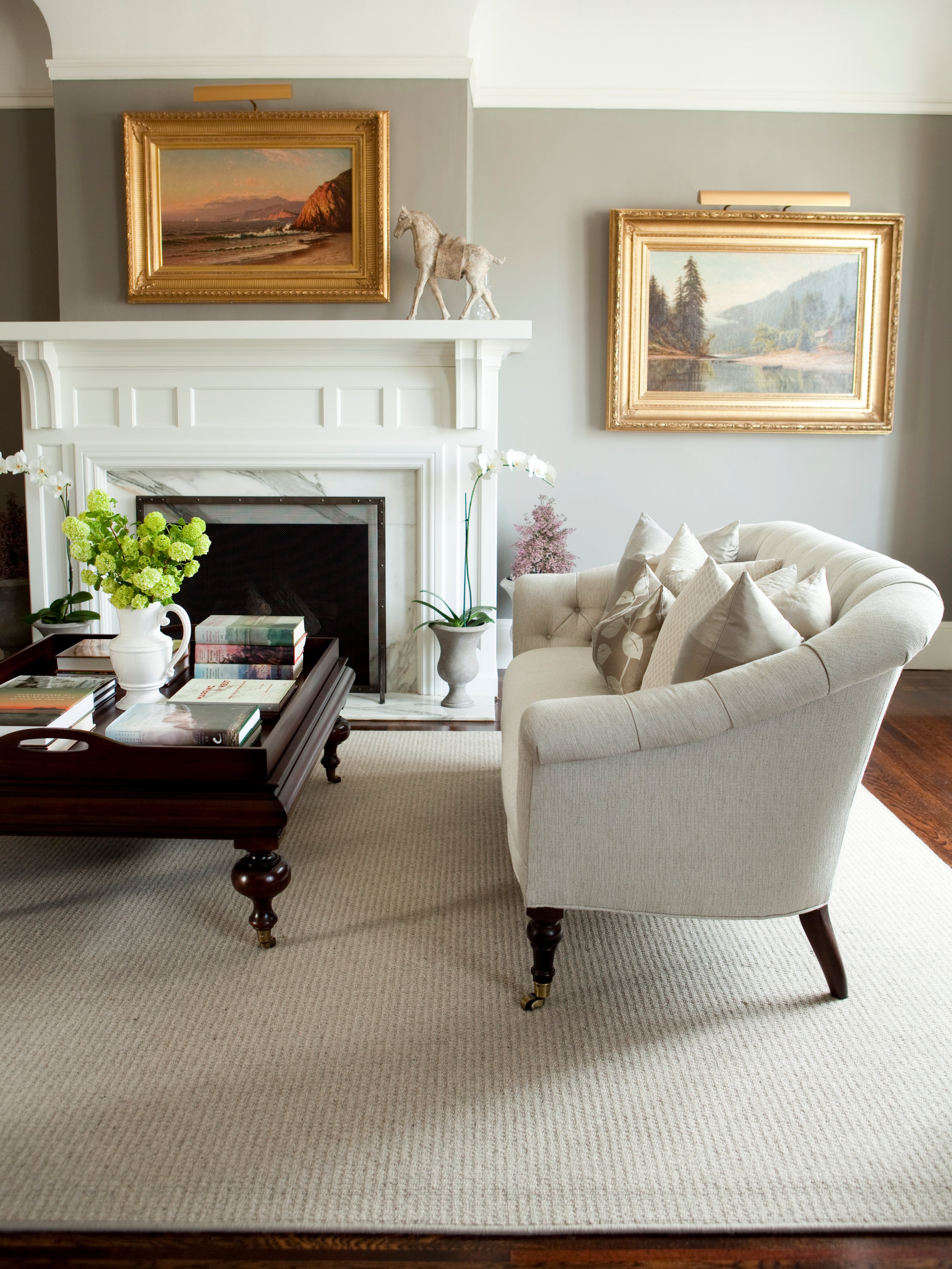
The New England palette is classic yet so modern and fresh all at the same time. The four colors in the palette – Row House, Harmonious, Tawny Tan and Noble Grey – are designed to work together harmoniously throughout a room, whether as a rich wall color, the pop of an accessory or even the furniture. It’s really these colors you see as a general theme throughout so many of my projects, and especially in the Presidio Heights project.
 Light greys and sage greens like Row House 408B and Harmonious 316D add a subtle shade that sets the stage for the rest of the design, while still holding their own against accent pieces and artwork.

While I tend to use Tawny Tan 327D and Noble Grey 417G as accents brought in through painted furniture or accessories, they can also serve as more statement making walls when you want to go bolder with your color.


This post is sponsored by Pratt & Lambert. For more information on the New England colors or to find your favorite regional palette go to https://prattandlambert.com
{Photos by Elijah Hoffman & Nicole Hill Gerulat}